Ton Mars (Dalfsen, 3.3.1950) is a Dutch visual artist who is living and working in Groningen. He makes abstract paintings, drawings, installations and writes poetic texts. Studied Fine Art at the Minerva Art Academy in Groningen and Philosophy at the University of Groningen and the Radboud University in Nijmegen.
INTRODUCTION
The artistic career of Ton Mars began with extensive experiments, trying out a very diverse range of media and techniques before turning to abstract painting. Especially in the work of Piet Mondrian and Barnett Newman, he recognised the formal clarity combined with the reflection on content that he, too, was striving for. He therefore decided in the 1980s to continue his work from where Mondrian and Newman had left off. Retaining abstraction, he complemented it with analogies between image and language and connected the two-dimensionality of painting with the third dimension of sculpture and architecture.
In the early 1980s, the artist began to develop a ‘sign language’ derived from parts of furniture and architectural ornamentation. The visual/linguistic potential of these forms became clear to him when he ‘recognised’ his initials TM in the abstracted parts of a chair. These precursors of today’s signs gained a place in works, where they stood out against secondary- and tertiary-coloured planes. These works were predominantly square, sometimes polygonal, and had a sensuous texture as the canvases were rough and the paint was applied in multiple coats. First and foremost, resembling paintings, they related to sculpture by being several centimetres thick. By the late 1980s, the abstracted forms became tighter, the paintings larger and their texture flatter. The forms also changed and became linear signs, anchoring themselves to the matt colour fields.
All signs belonging to this ‘language’ are composed of horizontal, vertical and diagonal lines and circular segments, parts of basic geometric forms and also of letters in the Roman alphabet. The elements are simple, but they can be endlessly varied and combined into more complex signs reminiscent of letters, numbers and everyday things. As a result, they encourage viewers to read and interpret, but the signs remain illegible, nor do they depict anything from perceptible reality. Assembled in different rhythmic compositions, they do possess signifying possibilities that can only be actualised when combined with the other features of Ton Mars’s work.
From the 1990s, the artist began to make multi-part works bearing titles. Between the horizontally arranged parts there are spaces, much like those between words in a sentence. At first, the parts look like two-dimensional ‘panels’ floating in front of the wall and casting shadows upon it, suggesting there is more going on here. This is confirmed when viewers walk past a work and the panels reveal their three-dimensional, tapered ‘bodies’. The multi-part works are monochrome in black, white and in primary colours with contrasting signs, seemingly carved into their matt surfaces.
During the last two decades of the 20th century, the development described above resulted in both the characteristic appearance of Ton Mars’s work and his artistic system. This system, which serves as the basis for his entire oeuvre, allows the artist to interweave the formal and conceptual aspects of his work in various ways. It guarantees both constants and possibilities for new combinations and is also flexible enough to allow ambiguities by applying analogies and metaphors.
Using analogies and metaphors enables Ton Mars to combine in his work personal ideas, experiences and preferences with cultural fields such as mythology, the arts, poetry and literature, various sciences and philosophy. Analogies primarily function between image and language in this oeuvre. They provide the signs, connect the formal elements of the works with the titles and allow the artist’s visual activities to be combined with writing. Ton Mars applies metaphors to link the spatial organisation of the Earth into continents, oceans, locations and compass directions to the areas, qualities, functions and attitudes of the human mind. In some works, spatiality is dominated by the social or mental world, yet even then earthly spatiality remains implicit.
Within Ton Mars’s oeuvre, space plays an important role, connecting real spaces, such as the two- and three-dimensionality of visual art and the extensiveness of the Earth, with the abstract spaces of spiritual worlds. Compass directions, areas, locations, roads and travel are therefore concepts that frequently appear in the spatial metaphors used by the artist. Such metaphors show the framework of human existence. They provide a foothold in reality, assign locations to mental possibilities and are starting points for desires for other worlds. But spatiality does not provide certainties in this oeuvre; there is always room for doubt and for an awareness of the inaccessibility of spaces and areas. This is why the titles sometimes name a fixed centre that can be understood both topographically and mentally, but that shifts visibly in the works or is even absent altogether. Such discrepancies are common in this oeuvre and relate to the artist’s worldview, which he first developed intuitively and was then reinforced through philosophy. Herein, the longing for a transcendent world is present, but the awareness of its inaccessibility is never far away.
Although Ton Mars’s work displays an unmistakable, individual quality, changes take place in his oeuvre, both formally and in terms of content. Intuition and explicit decisions, inspired by the reality outside the oeuvre, lead to new works. Some arise naturally from previous works, others show varying degrees of change. Nevertheless, there are constants, the most important of which is the artistic system. This is the engine that drives the oeuvre both formally and content-wise, allowing for extensions but not pushing for radical changes. There are also formal aspects of this system, such as the sign language and the monochrome planes that, although they can be varied, appear in all works. They guarantee the abstract character of all existing and upcoming works.
The foregoing outlines the processes used by the artist and characterizes his thinking and oeuvre. How these show themselves in the works will be discussed below by considering examples of individual works, series and projects, which follow each other in a circular way. Series include related paintings and drawings, while projects may start with paintings, then expand into books and installations to find their continuation again in series or in individual works. Except making visual works Ton Mars also writes poetic texts that assist his thinking and working process and reveal aspects of these to the audience of his work.
SERIES (a selection)
The first series of paintings linking earthly and mental realms is Synonymous Works for Continents of the Mind, 1991-1996. Here the title invites one to think of the works as continents of the human mind. The series consists of five monochrome works in black (38 x 319 x 10 cm), red (39,5 x 330 x 10 cm), white (38,5 x 319 x 10 cm), yellow (38,5 x 324,5 x 10 cm) and blue (39,5 x 330 x 10 cm). They can be thought of as synonyms, in that they resemble each other in general, but differ in detail. All the works have similar dimensions and a horizontal arrangement of parts, yet they each reveal an individual identity through their different colours and compositions of signs. Which colours and compositions belong to which continents of the mind, however, remains in limbo.
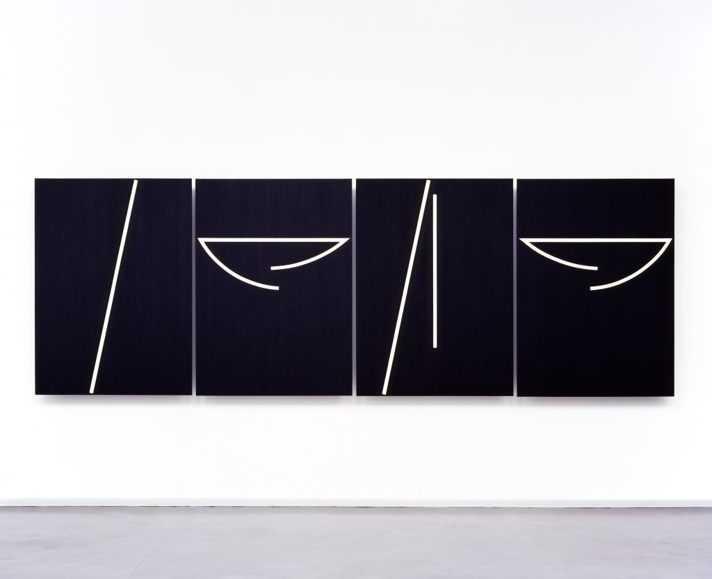
* The series Directions for the Center, 1993-1994, consists of five diptychs (81 x 123 x 10,5 cm per work) in black, blue, yellow, red and white. They were preceded by small black-and-white and white-and-black diptychs that are part of the Ab Uno / Ad Unum project and already show the sign compositions of the larger works. The collective title names a centre and the signs suggest a direction towards it, partly because the angled, ascending line on each panel – when the panels are joined – suggests a road. But the direction of this road is not unambiguous, as evidenced by the various colours of the works and the subtitles providing different attitudes for reaching the centre. Faith & Perseverance, Knowledge & Purification, Inspiration & Sacrifice, Desire & Devotion and Intuition & Experience are profane and religiously inclined attitudes required to arrive at the desired destination. So, there are multiple pathways and mind-sets to reach the centre, yet some formal features of the diptychs point to problems. Indeed, the signs forming the ‘road’ seem to continue in the empty space above the diptychs, and the mathematical centre of each work is located in the void between the panels. As a result, the place and nature of the destination become unclear and the centre seems inaccessible. The question may then arise as to whether such a centre exists at all.
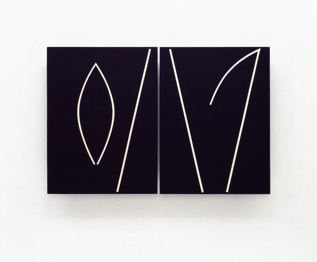
The series Disclosures II, 1994-1995, which consists of four white diptychs (115 x 176 x 11 cm per work), is also preceded by sets of Ones from the Ab Uno / Ad Unum project. Both the preparatory Ones and the works of this series have signs that appear together as horizontally positioned and opposing V-shapes. On each left-hand part, there is also an angled, ascending line that takes the ‘pivot point’ of the V-shapes beyond the mathematical centre of the two panels. This gives a suggestion of movement that can be seen as the rotating wicks of a windmill. And the continuous, and sometimes obstructed, rotational movements find their complement in the subtitles of the series. They describe socially and religiously tinged roles such as Guide & Seducer, Leader & Despiser, Teacher & Intruder and Prophet & Impostor that tie in with the collective title Disclosures II. The four works ‘reveal’ the dual nature of such roles. In society the first roles are usually valued positively, but they also have hidden negative sides that, under certain circumstances, can reverse them into their opposites. For Ton Mars, these roles are particularly interesting. They can be associated with artistry and appearing in his texts, they problematize his own roles as an artist and a teacher. The earthly spatiality is not emphasised here but is nevertheless implicit through the three-dimensionality of the works and the social nature of the roles.
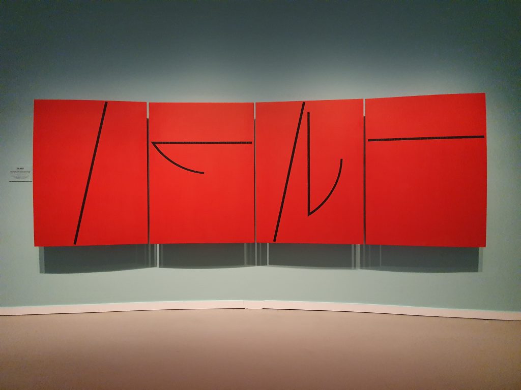
*For the Arrivals & Departures series, 1997-1998, the artist planned five four-part works (120 x 460 x 10 cm per work), three of which are executed in yellow, red and black. Their collective title points to journeys, structured by the ‘stations’ of arrival and departure. So, each work can be seen as a journey with its own colour and composition of signs. The yellow quadriptych is subtitled The Exchange of the East for Memory & Structure, the subtitle of the red quadriptych reads: The Exchange of the South for Passion & Colour and the black quadriptych bears the subtitle: The Exchange of the Center for Psyche & Space. This is where the exchanges of destinations, namely the compass directions and the centre of the compass rose, take place with properties and functions of the human mind and various formal features of images. Unlike Synonymous Works for Continents of the Mind, in this series the earthly and mental realms are named and their connections, aided by the exchanges, are reinforced. The space metaphor used here is given further direction by naming features of images, such as structure, colour and space. And this brings the traveller into the picture – the artist himself – who takes different roads during the process of making and tests different mind-sets to realise meaningful artworks.
THE AB UNO / AD UNUM PROJECT (1993-2018)

This project evolved from preliminary studies for larger paintings. The first five studies of Directions for the Center had as titles the numeral ‘one’ in various European languages. These Ones opened possibilities of involving ‘all the languages of the world’ in the oeuvre. The completed project comprises three sets of small three-dimensional diptychs, ‘inscribed’ with signs. Their titles all contain the numeral one in the languages of the continents Eurasia, Africa and the Americas. Although Ton Mars has a penchant for completeness, it was not his intention to draw a ‘world map’ in this way. Rather, he wanted to conduct dialogues between different languages/cultures and the characteristics of his work. To collect the numerals, he engaged in a collaboration with the art historian Katalin Herzog, which resulted in intensive dialogues, during an imaginary journey across the Earth, materialised in the Ab Uno paintings and the three related artist’s books.
The title of this project pertains to the collection of the numeral one in many languages, but also refers to creation stories in which the ‘one’ or the ‘first’ is reserved for the Creator. With Plotinus, a Neoplatonic philosopher from the 2nd century, the Creator is associated with the ‘One’ that endlessly overflows without losing substance, giving rise to the cosmos and its order. The multitude flowing from the One continues to yearn for its origin and wants to return to it, as described in the Latin saying: ‘Omnia Ab Uno, Omnia Ad Unum’. Everything emanates from the One and everything returns to it. However, the title Ab Uno / Ad Unum also refers to the functioning of the small diptychs within the oeuvre of Ton Mars. They emerge as Ones and generate several ‘follow-up works’, such as Directions for the Center and Disclosures II discussed above. But in the end the Ones, as everything that has resulted from them, will once again become part of the oeuvre.
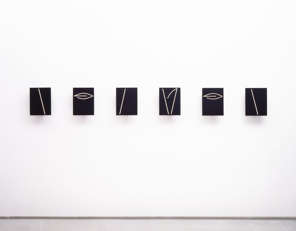
* The first set of Ones, 1993-1998, represents the Eurasian continent, which consists of black-and-white and white-and-black vertical diptychs (32 x 48,5 x 10 cm per work) that seem to open like pages of a book inscribed with signs. The combination of black and white panels evokes archaic orderings such as day and night, matter and mind, life and death. They may stand for everything that can be divided geographically, psychologically and artistically, but are also connected with each other. In the titles, Preface is added to the Eurasian numerals in the relevant language, because these Ones were preparative for larger works and the numerals are derived from written languages.
* The second polychrome set of Ones, 1999-2000, represents the African continent. This series comprises horizontal diptychs (48,5 x 32 x 10 cm per work) with each panel coloured differently. In doing so, Ton Mars breaks away from the use of primary colours in his works from the 1990s onwards and, as before, applies secondary and tertiary colours. The diptychs are inscribed with signs that somewhat resemble the eyes of African masks and bear titles with the numeral one in many African languages. Because of the traditionally oral cultures of this continent, the addition Preface has been omitted here, as in the next set.
* The third monochrome set of Ones, 2002-2015, represents the American continent. This set consists of square diptychs (28 x 56 x 10 cm per work), with both panels bearing the same monochrome colours. Their titles derive from the numeral one in the languages of Native Americans, while their colours and signs recall the landscapes of both Americas and the artefacts of the indigenous people.
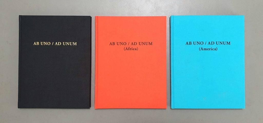
The Ab Uno / Ad Unum books, (1998-2018)
From 1998 to 2018, following the Ab Uno / Ad Unum project, three artist’s books were produced within the collaboration of Ton Mars and Katalin Herzog.
* Ab Uno / Ad Unum [Eurasia], 1998,
*Ab Uno / Ad Unum (Africa), 2001,
*Ab Uno / Ad Unum (America), 2018.
INSTALLATIONS (2007-2010)
In the first decade of the 21st century Ton Mars made four installations linking his painterly, sculptural and architectural interests. Significant changes occurred in this process. Unlike the paintings, the installations are site-specific and traversable. They are constructed out of Plexiglas panels and painted in glossy enamel paint using a roller, so that slight traces of the painting process remained visible. While the backs of the panels are white, the fronts feature a colour into which the signs are cut out. As opposed to the earlier three-dimensional, matt paintings, these panels are flat and glossy, reflecting everything in their surroundings, including the viewers. In earlier works the artist avoided such illusionistic effects, but here they appeared to be an obvious extension of the spatial character of his installations. All four installations bear the title Stazione, which can indicate a station, a staging post or a place of arrival and departure. The Staziones show a metaphorical way of travelling to enable the exploration of earthly and mental spaces in connection with each other.
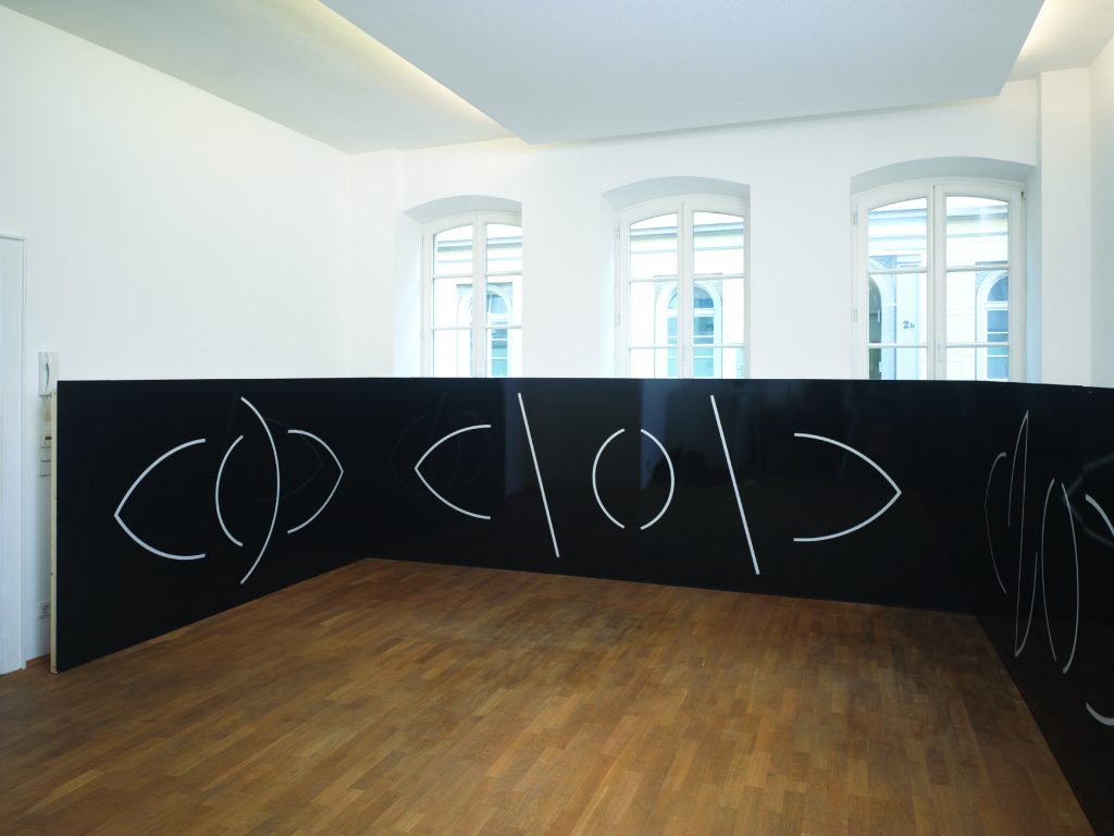
* Stazione I, 2007 was realised at the Cora Hölzl Gallery in Düsseldorf (Germany). This installation was 15-metres-long and had 140-cm-high black panelling running along three walls of the gallery. The two-dimensional panels were painted with glossy enamel paint. Hung high up, adjacent to one of the walls, was a 50 x 50 cm black cube titled Baldachin, indicative of the once customary canopies placed above special persons or objects. Visitors could sit below Baldachin to survey the reflective panelling with its rhythmic, white signs. As such, the gallery became a ‘staging post’ where people stayed for a while to look at art and then continued their way inspired.
* Stazione II, 2008 was made at Stiftung Insel Hombroich in Neuss (Germany). This installation, measuring 21.40 metres in length and 180 cm in height, was realised by the artist in the 50-metre-long pavilion on the grounds, The Field Institute. The long, narrow space reminded Ton Mars of a platform, allowing him to place additional emphasis on travel. On both walls were blue and red panels that at times mutually reflected each other. Together with their white signs, the panels conveyed the impression of trains rushing past each other towards their destination, a blue and a red tondo respectively, each with a diameter of 90 cm. As the pavilion only had one entrance, visitors had to walk to-and-fro to leave the installation, thereby performing the movements the artist had suggested in this work.
* Stazione III, 2009 took place at the former Groninger Museum in Groningen (The Netherlands). This installation, measuring 23.70 metres in length and 2 metres in height, fitted exactly into the existing hall, but its U-shape, composed of celestial blue panels with white signs, also had independent features. Through two small, three-dimensional works, viewers were led into a ‘perfect space’. Whether this was a heavenly or earthly space remained unclear. This ambiguity came about, because the artist contrasted the impression of a celestial colour with the banal Plexiglas panels, the household enamel paint and also introduced irregularities in the compositions of the signs. In this way, he suppressed the viewers tendency towards contemplation and encouraged them to actively experience this heterogeneous space.
* Stazione IV, Ort der Schrift, 2010 was realised at the Cora Hölzl Gallery in Düsseldorf. This installation consisted of a 12-metres-long, 2-metres-high and 2-metres-wide, red-brown block in the middle of the gallery. Hanging on the walls were five light blue tondi with a diameter of 1 metre. The block, composed of reflective, red-brown panels with white signs, formed a closed mass around which viewers had to walk to experience the contrast between the earthy gravitas of the block and the celestial lightness of the tondi. Stazione IV is Ton Mars’s most sculptural/architectural work yet. In this installation, ‘painting’ was subservient to the overall impression, but the essential ‘writing’ of the signs retained its prominence.
TONDI (2008-2016)
From 2008, Ton Mars made several tondi that fulfilled different functions within installations. During his residency at Insel Hombroich however, he began making small, round works in acrylic paint on paper that would spawn the project Radical Expansions, which in turn prompted other follow-up works. Tondi – widely used in sculpture and painting, especially in the Renaissance – present compositional problems in representational images for which Renaissance painters found various solutions. As far as is known, however, Ton Mars’s tondi are the first works where such elaborate and systematic solutions have been sought for abstract compositions in a circular form. In the context of the artist’s oeuvre, the tondi show the possibilities of his sign language in which the signs are subjected to extensive variations and mutations without losing their distinctiveness.
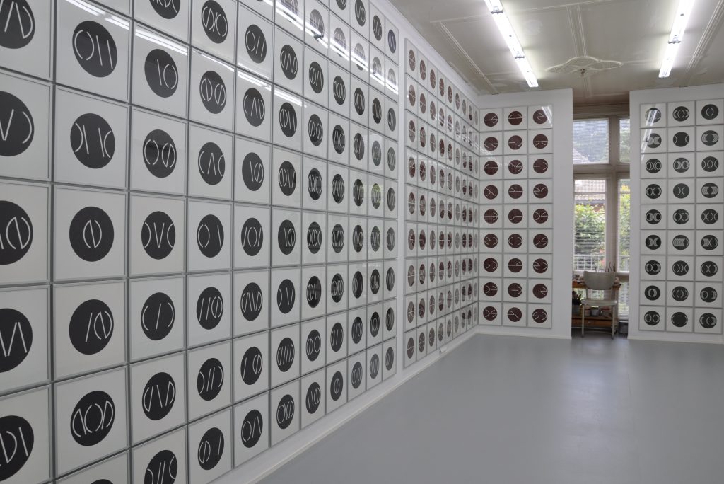
* The artist composed the project Radical Expansions, 2008-2016, from small tondi in acrylic paint on paper (19-cm-diameter per tondo in frames of 31 x 31-cm). Eventually, the many tondi formed large expanses that could cover entire walls. With this project, Ton Mars temporarily departed the geographical/mental macro space for the micro space of cellular biology. He associated living cells – containing DNA – with ‘signs cells’ in the form of tondi. From previously used signs, by analogy with stem cells, he assembled ‘stem signs’ that he subjected to systematic mutations. This generated ‘stem groups’ with white stem signs in tertiary coloured tondi that show their ongoing evolutionary development.
* The series From Name to Name, 2015, is a modified version of Radical Expansions. As preparatory sketches, Ton Mars combined tondi with the stem signs of the previous project and signs, inspired by Arabic ‘superscript’ the result of which reminded him of ‘letters’ that could form a ‘name’. When the tondi were worked out in acrylic paint (19-cm-diameter) the artist became curious about possible variants in which such a name might come into its own more effectively. Therefore, he applied ‘improved’ tondi below and above the original ones, arriving at multiple cross compositions with subtitles such as The Original Name, green (217 x 124 cm, measuring the greatest length and hight), The Conditional Name, red (217 x 155 cm) and The Creative Name, black (155 x 155 cm). Such improvements often appear in sketches but are rare in finished artworks. Inspired by philosophy in which doubts can form the basis of critical thinking, the artist showed his improvements to make the creative and cognitive processes in his work more visible to viewers.
* The work The Initials (2014) consists of six large tondi (95-cm-diameter per tondo, 20 cm apart) that bear the initial signs of the Names. The artist saw that these signs were powerful enough to function independently and connected them with initials of individuals, such as his own initial TM, which played an integral role in the development of his sign language. At the same time, he associated these signs with the enlarged and decorated initial letters in medieval books that structured the sections of the texts. The Initials are painted with enamel paint on Plexiglas in the colours: green, taupe, yellow, red, black and blue. By means of the strong characters of the signs and the expressive colours, the large tondi clearly convey distinct personalities.
GIFTS OF THE BOUNDLESS HEART (2020 -)
This project includes Ton Mars’s most recent works that will function within a sequence of 16 paintings. In 2020, he published plans and several designs for this in the cahier Voorjaar 2020 of De Ketelfactory in Schiedam (The Netherlands). Small preliminary studies and a few large paintings have meanwhile been completed; the rest will follow in the coming years. The artist is basing this sequence on the four elements of earth, water, air and fire, which the pre-Socratic philosopher Empedocles (c. 490-430 BC) conceived as ‘the constituents of all matter’. These elements supplied four subtitles: Winds of Birth & Death, Waves of Changes & Continuity, Flames of Origin & Destiny and Grounds of Emptiness & Lucidity. Classified under these, the winds, oceans, volcanoes and deserts obtain their ‘own names’ that will interact with the formal elements of the paintings. Ton Mars sees this sequence, both formally and content-wise, as an extension of the series and projects discussed above. But the completed works already show that there will also be formal expansions and deepening of meanings arising from the ongoing development of the oeuvre.
TEXTS
Except making visual works, Ton Mars also writes poetic texts that accompany his visual works in catalogues and other publications, and reveal aspects of his thinking and creative process. The texts bear the collective title Hermetica and feature trialogues in various locations between three fictitious characters whose reflections on the world are coloured by their origins and temperaments. Anthony (Mink) Swindon comes from the north, Rachman, from the west and Giovanni from the south. They represent three regions of the mind that are indispensable to the artist. Art and literature belong to Anthony (Mink) Swindon. Rachman represents philosophical thinking and Giovanni points the way to transcendence. For the artist, these characters fulfil important functions. Because of their differences, they enable the opening of a ‘fluid self’ during the creative process that can change points of view and try out different mental attitudes. Within their conversations, they play with different analogical and metaphorical possibilities, already exploring new connections for Ton Mars to work out in his oeuvre.
Texts about ‘the painter’: ‘Hermetica (Derde locatie), Strategieën voor het hoofd, Fragment’, 1996.
“Giovanni:
His land has no earth, his fields are barren.
His pastures feel neither dewy nor dry.
His forests allow no shelter or passage.
His mountains endure no ascent,
His valleys give no protection.
His seas carry no water,
His rivers flow without beds.
His villages are not founded, his cities are not built.
His existence knows no ground.
His spirit dwells in each body.
Rachman:
The painter is a charlatan, a player of the most intrusive kind.
He lies and plays for reality.
Fierce and startling, clever and naive at once.
He shows us a painting and calls it image.
He shows us an image and calls it reality.
He dances with the truth, yet in his hands it becomes shadow.
He dabbles with views, yet in his grasp they become illusions.
He sleeps with ideologies,
yet in his embrace they become dreams.
Deceiver, player and speculator!
He hoists himself upon the strongest shoulders and crawls into the lee
of the broadest backs.
Put him in the wind and we will see what befalls him!
Anthony (Mink) Swindon:
Shine, painter, shine!
In royal yellow, in devilish red and in virgin blue.
Shine, painter, shine!
In cleansing white and deepening black.
Shine, painter, shine!
Beyond reason and rhyme.
Turn my head, spin my mind.
Lure my eye into order and beauty,
seduce my gaze
with chaos and adventure.
Dazzle me with fact and fiction, cloak me in your utopia.
Be the intruder, whom I make my guest,
the seducer, whom I appoint my guide.
O charlatan, I convert you into a prophet.
O messenger, I use you as a thief.
Condense my emptiness, prolong my time.
Reave me from this harsh reality.
Cool me with the ice of your persistence,
warm me with the glow of your conviction.
Silence me, set me free.
Grant me dreams for a place, imagination for a home.
Split my ceiling and shake my floor.
Open my window and unlock my door.
Hinge between all possibilities,
send me in all directions.”
From: Reflecties op de Schilderkunst II, Groningen, Academie Minerva Press 1996, pp. 52-54.
Text by: Katalin Herzog, ‘Overzicht van het beeldende werk en artistiek system van Ton Mars’, 2022.
The original text was translated from Dutch into English by Jenny Wilson.