Katalin Herzog
Interpretation of a triptych by Ton Mars
Published in Feit & Fictie (tijdschrift voor de geschiedenis van de Interpretatie). Jrg. III, Nr. 3, 1997, Groningen (NL).
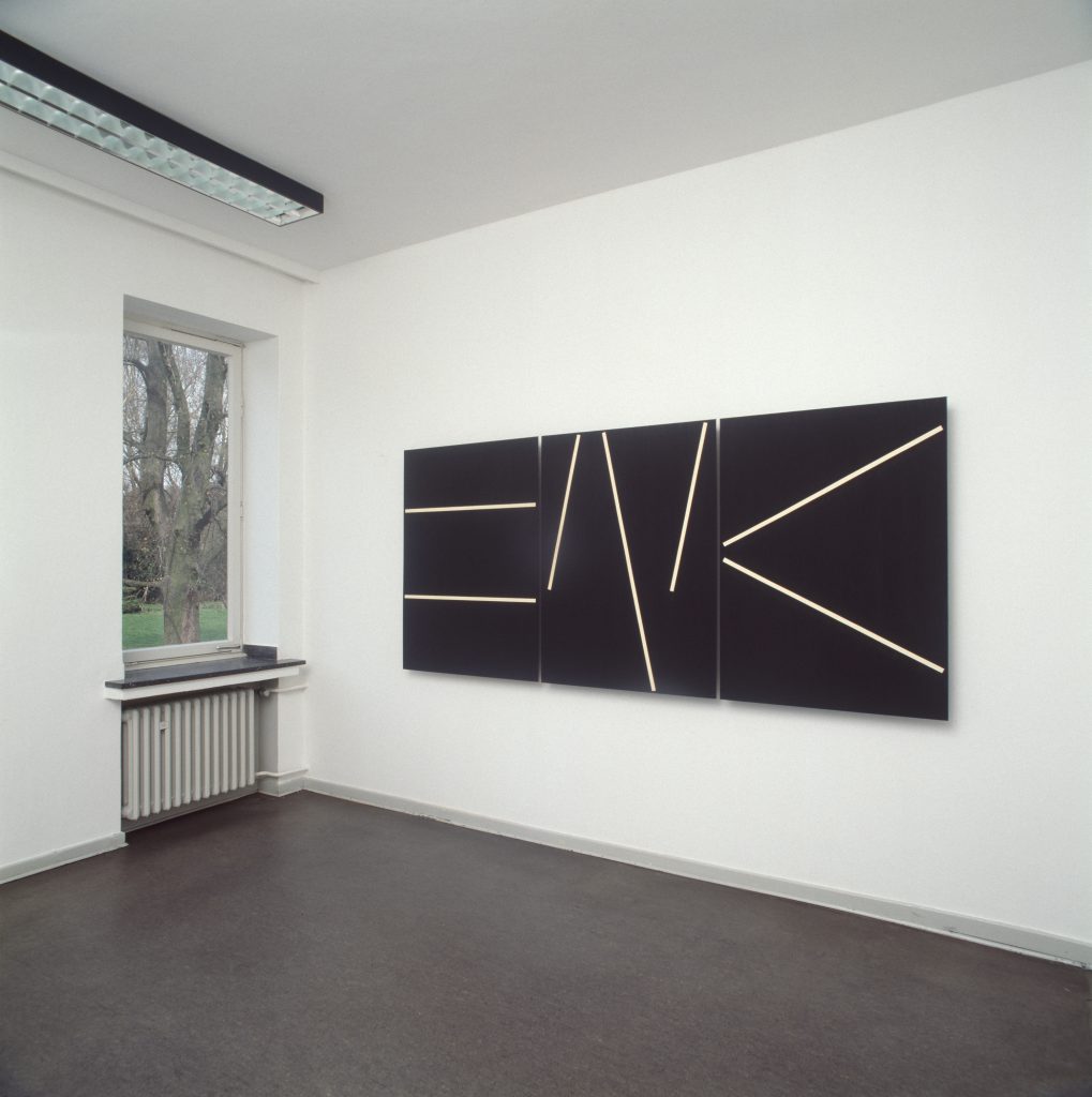
Figure 1
Glattes Eis Ein Paradeis Für Den, der gut zu tanzen weiss
Friedrich Nietzsche1
A contemporary work of art often resembles a palimpsest: a parchment on which a new text has been written through which older layers of text are still vaguely visible. Older and newer ’texts’ become intermingled in the work, which gives it a heterogeneous nature. The layers obliterate, append, and modify each other, thus creating new and surprising meanings. However, because of this intertwining of meanings, it is not easy to come to grips with such a work. It is as if we are confronted with a complex personality that we will only begin to understand after repeated encounters. I will illustrate such a process of ‘meeting and getting to know a work of art’ by interpreting the triptych Winner, Saviour, Loser (1994) by Ton Mars. (Figure 1) As part of my interpretation, I will confront this triptych — which at first glance seems a modern work — with other pre-modern and modern works, with the express purpose of highlighting its ambiguous, post-modern nature.2
Interpretation as encounter and conversation
Meeting and getting to know a work of art is a double metaphor that suggests an analogy between the ways we deal with people and with works of art. And indeed, both meeting and getting to know people and viewing and understanding works of art may be regarded as interpretation processes. In both cases, we meet an unfamiliar complex, which we should first perceive as intriguing before we can open it up by familiarising ourselves with it. Hans–Georg Gadamer has compared this hermeneutic process in our dealing with art with a conversation (the interplay of questions and answers) between two people.3 According to Gadamer, a work of art needs to be understood in the same way as a human being, while the beholder assumes that there is something to be understood, i.e. that the work has an identity. If he accepts the invitation, the beholder may come to an interpretation that contains answers to the questions posed by the work. During this ‘conversation’, the interpreter balances between strangeness and familiarity, because both the work and the interpreter are part of a tradition in which knowledge and shapes of the past are accumulated. Although the tradition is familiar, it must also have developed cracks or deviations, or else the interest of the beholder will not be aroused and the interpretation will not be undertaken.
According to Gadamer, an interpretation of a work of art involves a double ‘horizon of experience’: the knowledge and experience the beholder already possesses, and the horizon of experience represented by the work of art. If the dialogue succeeds, the two horizons will merge. There is an important difference here between meeting another individual and the interpretation of a work of art as understood by Gadamer. The interpretation of a work of art is not about understanding the mind set of its maker but understanding a solidified complex of ideas. The maker himself is also a ‘reader’ of his own work. However, he can also be the first interpreter and become the initiator of a ‘history of interpretations’ that will continuously grow over time, because each new interpretation will absorb all previous interpretations by confirming or rejecting them. The tradition and the interpretations are also incorporated in the expectations with which a beholder approaches the work. Thus, he will observe the parts of the work so that he can constantly revise his knowledge of the whole through his understanding of the parts. But the parts, too, will be experienced differently in the light of the whole. Interpretation not only resembles a conversation but also a dance in which the beholder approaches the work and withdraws again; a dance in which he moves from apprehension to misapprehension and back again. During these motions, both the work of art and the interpreter change. The work’s history of interpretations becomes richer, and the interpreter can relate his experiences with the work to his life.4
For various reasons, the Winner, Saviour, Loser triptych by Ton Mars — which will be interpreted here primarily with the help of Gadamer’s hermeneutics — is highly suitable for demonstrating the process of meeting and getting to know a work of art.5 The first reason is that it is a non-figurative work that does not contain anything ‘recognisable’ from every-day life. Such works explicitly invite interpretation or are ‘in need of commentary’ according to Arnold Gehlen.6 Furthermore, it is a triptych and has a ‘familiarly sounding’ title, aspects that arouse one’s curiosity about the link between pre-modern and modern elements in the work. I also have personal reasons for this interpretation. The triptych has intrigued me from the moment I first saw it as a sketch, so that my interpretation began exceptionally early. My knowledge of it constantly grew through conversations with the artist whose oeuvre I am familiar with.7 However, I still do not know everything about the work; whenever I look at this triptych, it appears somewhat obstinate: the work seems to invite interpretation but also promises to resist it. There are, therefore, sufficient known and unknown factors to make the following interpretation an adventure. In my interpretation, I will use the metaphor of meeting and getting to know a work of art by imitating what happens when two people meet. Thus I will first study the ‘physiognomy’ of this work and relate it to its ‘name’ and ‘behaviour’. Then I will search for ‘family resemblances’ in art history and relate the triptych to other features of the artist’s oeuvre. In this way, I hope to discover some unchanging ‘characteristics’ and to show what the work may mean to us.8
Physiognomy, name, and behaviour of the work
Although Winner, Saviour, Loser has a pregnant title, I will not yet include it in my reflections. This is in accord with the way it was presented to the public. The title had been stated separately on a list in the Akinci gallery in Amsterdam where the work was shown for the first time in 1995.9 The artist thus placed the size, ‘colour’, and ‘design’ of the work in the foreground. During the exhibition and on previous occasions I had seen it in the artist’s studio, the triptych impressed but also disturbed me. I believe it owes this double effect to its specific visual and kinaesthetic qualities. The three ’truncated pyramids’ that constitute the ‘bodies’ of the work present their base to the audience and together appear in one’s field of vision as one large, black and heavy form. Because of its height and the way in which it hangs on the wall, the work takes the human dimension into account, but its width is very great, which gives one the urge to stand in front of it with arms open wide.10 Thus the beholder is invited to look around and either to push the work away or to embrace it, partly also because the ‘panels’ are three-dimensional and slightly protrude from the wall. The surface is matt, deep black, and intersected by light-coloured ochre lines and by the gaps between the panels that are as wide as these lines. The lines that almost touch — but never cross — the edges of the panels have the same effect as narrow bands of light entering a room at night: the beholder is inexorably drawn to them. The nocturnal blackness of the surface has an absorbing quality, while the lines strongly reflect the light.
It could be expected that the equal dimensions of the individual panels would guarantee that the beholder gives equal attention to each of the three parts, but the grouping of the lines belies this. For this reason, even at first glance the panels exhibit a heterogeneous nature and refuse to join together. Still, there does not seem to be any confusion about the direction in which the work should be ‘read’, because the left panel contains two horizontal lines that work as lines of text, while the other panels contain signs that resemble writing. The work therefore confirms the Western way of reading from left to right. The emphasis on the beginning and the static composition of the first panel ensure that the beholder’s gaze will linger over it longer. Only after some time it becomes apparent that the three horizontal rectangular fields into which this first panel is divided do not have similar dimensions. This creates a mildly centrifugal dynamic in the composition. The beholder’s gaze will return again and again to this seemingly quiet introductory panel and will linger there. It will take some effort before the beholder can continue and move towards the central panel, which contains three lines: two short lines slanted to the right, with a long line slanted to the left in between. The long slanted line gives this plane a rising effect, which is reinforced by the two shorter lines that seem to push and pull the longer line upright, as it were, until it seems almost vertical. Here, too, it takes an effort to continue reading and to arrive at the right panel, in which two diagonal lines meet at the left side and divide the plane into three (near-perfect) triangles. This optically creates a ‘joint’ at the top of the central triangle that makes the line pivot away from the corners of the plane and towards these corners again. This dynamic interplay is not limited to the right panel, but returns the beholder’s gaze to the left again by way of the centre. Only then will the connection between the three panels — which seemed so disparate at first — become apparent.
When one looks back from the third panel to the first, an (imaginary) horizon becomes visible in the work, which simultaneously strengthens the rising effect of the centre. The relationship shared by the almost autonomous parts has now become clear too. The rectangle in the centre of the first panel is transformed to a parallelogram in the second. This shape is dissected by a diagonal, which creates triangles that are related to those of the third panel. Thus the introductory rectangular motif is repeatedly translated, as it were; the last translation — three triangles in the right panel — may be linked to the three rectangles of the beginning. Both outer panels suggest clear shapes, while in the centre a virtual, but not closed, form may be constructed. All this gives the centre its interpretive, intermediate role. The triptych can therefore be ‘read’ in various ways. The beholder can follow the usual direction of reading from left to right, but will then find all kinds of obstacles on his way, which distinguishes the panels as individuals and slows down the viewing. From right to left, however, the viewing proceeds smoothly, partly because the acute-angled triangle on the right panel points to the centre like an arrow. Only after this second reading will the beholder be able to focus adequately on the centre, so that the two outer panels can function as the wings of a triptych that seem to open and close. The complex nature of these viewing motions adds the dimension of time to the work and evokes an interplay of heterogeneity and homogeneity. No matter how often one looks at the work, it will attract one’s attention again and again.
This exterior, which seems highly exciting when studied closely, is accompanied by an intriguing name — Winner, Saviour, Loser — which I will now relate to the previously described viewing motions to make the coherence of the total composition even more apparent. The first panel is called Winner and makes a quiet, fairly undynamic impression. If the signs that resemble monograms are combined with the titles and regarded as personifications, this composition could also refer to the balanced state of mind of an individual who is certain of winning. This is opposed to the right panel, which seems restless and lively. This may have something to do with the troubled mood of the Loser. The rising central panel personifies the Saviour, who maintains a relationship with the two other personages: an impersonal one with the Winner, since he pushes the Winner away, as it were, and a close and even suffocating relationship with the Loser, which seems to be sucked towards him. The close bond between the Saviour and the Loser creates the coherence within the triptych. I have now related the compositions, in which there appeared to be a transformation of the same motif, to the parts of the title, and thus experienced a suggestion of personifications and moods. At this point, I can only move forward with my interpretation if I also relate the total form of the work — the triptych and the images that go with it — with what has gone before.
Family resemblances in art history
Triptychs are highly familiar types of images in Western art history. They enjoyed their first flowering in medieval religious art as altarpieces that portray biblical events. Since the Renaissance, the triptych has also been used for profane images such as portraits and mythological scenes. A second profanation took place in the nineteenth century, when both realists and symbolists used it. In fact, the triptych has never disappeared from art; it is still a frequently used form in modern figurative and non-figurative painting. Winner, Saviour, Loser fits in with this tradition. However, at first glance it only seems related to its sacral side, since it is a triptych with a centre that is special from a compositional standpoint — in the same way as many medieval triptychs — while part of the title immediately reminds one of the ‘redeemer’, of Christ. The question then arises if this work also contains profane meanings. And, if so, what is their connection with the sacral and how can this be related to the history of the triptych outlined here?
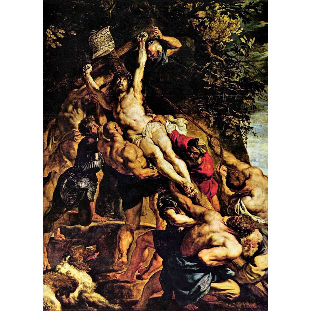
Figure 2
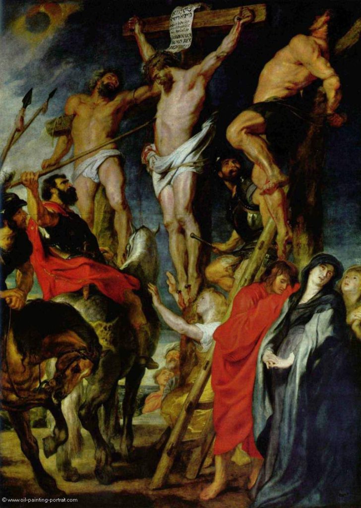
Figure 3
Because religious connotations in Winner, Saviour, Loser immediately come to the fore when the image is linked to the title, I will begin by searching for common elements with Christian iconography. All iconographical motifs that may be relevant here have something to do with Christ’s crucifixion. Through the centuries, many artists have portrayed ’the crucifixion’. Perhaps the most exiting treatment of this subject has been provided by Peter Paul Rubens, who, although he used older artistic conventions, was unsurpassed in his portrayal of this climax of the Christian drama.11 In the central panel of his altarpiece The Crucifixion (1611), he shows how the crucified Christ, who is portrayed in a strongly diagonal position, is pushed up by figures on the left and pulled up by figures on the right of the panel. (Figure 2) The hilly terrain of Calvary supports the brutes that are to perform this hard and cruel task. The brightly illuminated body of Christ and his upward gaze point forward to the vertical position he will finally assume. Another altarpiece by Rubens, The Spear Thrust (1620), portrays a crucifixion that is sometimes also referred to as Golgotha, in this case on a single panel. (Figure 3) Christ, who has already died on the cross, has been placed in the centre of the image. He is flanked by the good thief and the bad thief, Dismas and Gestas, who had been crucified with him.12 The good thief has accepted Christ and looks resigned to his fate. Their bodies are slightly turned toward each other and the thief has been portrayed almost parallel with the plane of the image. The bad thief has denied Christ; he has turned away from him and fearfully contorted his body at a sharp angle. Because of the bright illumination and the composition that spreads out from the base of the cross towards the figure of Christ, the beholder’s gaze is guided exclusively to Christ. Despite the horrible nature of the crucifixion, it is easy to identify in both works with the ‘redeemer’ through the central position of Christ and the emphasis on his corporeality.
The similarities of the compositions of these two altarpieces and the work by Ton Mars are striking. The central panel of Winner, Saviour, Loser has a similar composition as Rubens’s Crucifixion. In both works, a diagonal is placed upright through opposite movements, as it were. Also, the composition of Ton Mars’s entire triptych seems to echo The Spear Thrust. In the central panel, the Saviour corresponds to Christ, while structurally speaking the Winner and the Loser seem to resemble the two thieves, although their relationship with the Saviour is opposed to the relationship shown by Rubens. Does Winner, Saviour, Loser represent a latter-day variant of the Christian drama and has the artist derived its composition from Rubens, or is my interpretation now going astray? Before he created the work, Ton Mars knew Rubens’s Crucifixion, but not his Spear Thrust, and he had not studied Rubens’s oeuvre beforehand. However, he was familiar with such religious images and it is therefore possible that images stored in his memory partly influenced the work’s composition. Multi-part works are the rule in his oeuvre but, so far, triptychs have been rare. He did know, however, that this form and the sacral connotation of the title could suggest a religious interpretation and he accepted this, because the sacral plays an important role in his work, albeit not an unambiguous one.13
In this triptych by Ton Mars, the sacral thus strikes a note in the composition, the title, and the total form, and this becomes even more evident in the confrontation with Rubens, but I would not do justice to his work or that of Rubens if I were to make a simple comparison between the two. Rubens created religious paintings that were to confirm and strengthen the power and domination of the Roman Catholic faith through composition and rhetoric. Christ’s passion is represented fairly unambiguously here, as the sacrifice that allows our souls to be saved. For a contemporary artist, however, such a worldview is no longer valid, although weak echoes of it may still be present. Furthermore, we are dealing here with the work of an artist who feels akin to twentieth-century avant-gardes, and to De Stijl en abstract expressionism in particular. Therefore, we should also look among abstract and non-figurative painting for connections between Winner, Saviour, Loser and triptychs or other canvasses that can be related to this work.
Figure 4
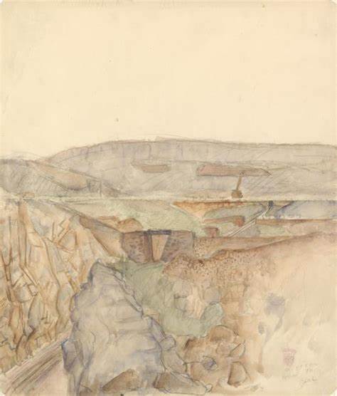
Figure 5
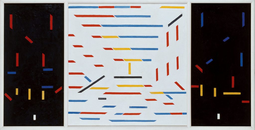
It is striking that the artists of De Stijl made use of the triptych as an art form to reinforce their claims that their art strived for transcendence.14 I would like to draw the reader’s attention to Composition no.4 (The mine) (1916) by Bart van der Leck. (Figure 4) This painting, which is also sometimes referred to as the Mine Triptych, shows some resemblance with Winner, Saviour, Loser. The Mine Triptych has a square, white central panel with horizontal, vertical, and diagonal lines in primary colours, and two half-as-wide side panels with a black fond on which lines of the same colours have been drawn in the same directions. The artist prepared for this work by making sketches in various Spanish and North African mines and increasingly stylising a mine entrance in several stages until he arrived at an abstract composition with a T-shaped cross in the centre.(Figure 5) On the dark side panels, one can discern stylised outlines of miners. Thus, what we see here is a profane topic — the hard work in the mines — shown by means of a form — the triptych — that is linked to sacral themes. This is a highly successful procedure to elevate the profane to a higher level, since, according to Klaus Lankheit, the triptych works as a ‘pathos formula’ — a standard form that gives the image a sacral effect, regardless of whether the image is religious or not.15 Carel Blotkamp, therefore, interprets Mine Triptych as a modern Calvary that links the suffering of the miners to Christ’s passion, in an analogy with nineteenth-century realism in which labourers were elevated to the status enjoyed by the saints of earlier eras.16 Although this is an abstract work, this interpretation allows one to be affected by the difficult lives of these labourers, the modern cultural heroes par excellence. As with the work by Rubens, there is no direct connection between the work of Van der Leck and Ton Mars, but we are coming closer in a formal sense, because Van der Leck used an abstract form-language of uniform white/black fonds and coloured lines. However, he was after a direct abstraction from visible reality, while Ton Mars starts from non-figurative images that may assume different meanings through variations. This interpretation however, will become more fruitful if we accept the idea that abstractions of profane reality too can apparently be linked easily to sacral forms and connotations by way of the pathos formula of the triptych.

Figure 6
Despite external similarities, Van der Leck’s work is far removed from Winner, Saviour, Loser. The work of Barnett Newman leads me to a different approach. He often gave his canvasses a division by using ‘zips’, narrow bands of colour that differ from the dominant colour of the rest of the painting. The red painting Vir Heroicus Sublimis (1950-51) has five zips in orange-red, white, brown, orange-red again, and yellow ochre. (Figure 6) Narrow vertical bands modulate the (almost) monochrome colour plane by splitting it open, as it were, and thus intensifying the colour.17 According to Newman’s instructions, the beholder should stand very close to his large paintings, so that the colour field will enclose him or her like a dome.18 The zips have a double function here. They have a vertical effect by confirming the upright position of the beholder in front of the canvas and they also work ‘horizontally’ by dividing the canvas into ‘panels’ or, alternatively, by pushing against the edges of the colour field. Thus, they wrap the colour space around the beholder like an envelope or the side panels of a triptych. Although he incorporated Christian religious elements in his works in addition to Jewish elements, it was not Newman’s explicit intention to paint triptychs. Still, the painting discussed here does have such an effect, because the second zip from the left and the third from the right demarcate two equally wide ‘side panels’ that are also approximately half as large as the undivided, red ‘central panel’.19 Therefore, the pathos formula of the triptych has an implicit effect here too; it confirms the sacral colour space of the painting.
To Newman, the elevated, the sublime, was the goal of modern painting. He emphasised this with his title, which may be translated somewhat inelegantly as ’the sublime heroism of man’. In The sublime is now, which he wrote as early as 1948, Newman explained his concept of the modern sublime as follow: ‘Instead of making cathedrals of Christ, man, or “life”, we create them out of ourselves, out of our own feelings.’20 Newman, therefore, was not attempting to achieve an identification with Christ’s suffering, as was Rubens, and neither was he looking for an identification with the lives and suffering of labourers, as was Van der Leck. Instead, he was after what we — the beholders standing in front of the painting — experience: our ‘place’ in the world, our personal identity, as evoked by the intensive colour.21 Newman’s painting does have a relationship with our body through the effects of the colour, the zips, and the position of the beholder I have described above, but these are only devices for achieving an individual, sublime experience that do not offer any identification with other individuals, as was the case with the corporeality in the works of Rubens and — to a lesser extent — in the work of Van der Leck.
The heroes and their possibilities
It appears that Newman’s work is highly different from Winner, Saviour, Loser too. However, it has become clear that non-figurative elements such as a monochrome fond and coloured stripes can complement the pathos formula of the triptych and contribute to the sublime and exalted effect a painting may produce. This can also be recognised in the work of Ton Mars: the form of the triptych, the monochrome black (which is used by many modern artists who emphasise the sublime) and the ‘stripes of light’ have a similar effect.22 However, in the case of Winner, Saviour, Loser, such effects must be supplemented with elements we have encountered in Rubens and Van der Leck: the identification with religious or cultural heroes, i.e. with other individuals. The ambiguity of the sacral and the profane discussed earlier should also be investigated further. Let us therefore return to the title: Winner, Saviour, Loser. It reminds one of heroes in a story, but despite the emphasis on the Saviour, this story need not be about Christ and the thieves crucified with him.23 It may also be heroes that we know from fairy tales and myths, or through the ‘roles’ we play in every-day life. Thus, a social reality may be linked to a mythical reality, as in Van der Leck’s work. And the myths need not originate in religion or a distant past; they may also be derived from American films and television productions, in which the winner and the loser are well-known personages. It may even be that a more recent saviour such as Superman or Batman or modern cultural heroes such as Nobel Prize winners play the leading parts.
Although the sacral tone of the work has been demonstrated, such a shift to a lower level does not constitute an anticlimax. This is also evident from comments about the painting made by Ton Mars.24 He stated that the personages referred to in the title may represent shifting values. It may be that the Winner has only gained a material profit, but is a Loser spiritually speaking, which could be gleaned from his limited involvement with the Saviour. The Loser, then, could have suffered a material loss but gained a spiritual benefit in view of his close relationship with the Saviour. But even the role of the Saviour is not unambiguous according to Ton Mars. If God does not exist (any more) — and despite the sacral connotations of his work, the artist believes this to be true — who, then, is this Saviour? Does he represent a general sense of compassion and does he have altruistic motives, or is he someone who acts as a saviour out of egotism? In other words, is this a Mephisto rather than a Christ, a Seducer rather than a Guide?
The heterogeneous and homogeneous effects of the panels described above are therefore entirely congruent with these ambiguous meanings. If we read the triptych from left to right (which, as we have seen, is difficult), it tells a story about possible states of mind that ends in low spirits with the Loser. If read from back to front, we will arrive at the Winner in an upbeat mood. And if we start with the Saviour, we can see him in the double role of Winner/Loser and as a trinity that unites all three roles within himself. As an unexpected but not obligatory bonus, this interpretation also shows that the Saviour — Christ — has a double nature too (human and divine), and that he is part of the divine trinity.25
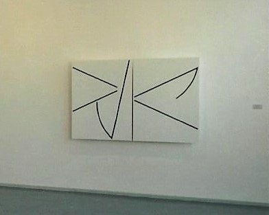
Figure 7
To Ton Mars, the ambivalent role of the Saviour had not been exhausted with this painting. Following on this triptych, he painted Guide & Seducer (1994), a white diptych with black signs. (Figure 7) Both works are part of series that he has not completed yet, but Guide & Seducer already contains so much of the possibilities of the heroes that I can include this work in my interpretation.26 The Guide is portrayed in the left panel by two signs: a recumbent V-shape positioned high in the plane and pointing to the centre and an oblique line slanting to the right with a quarter circle at the bottom. The Seducer is represented in the right panel by two diagonals pointing to the centre, the upper one of which also ends in a quarter circle. Some of the ascending force of the Saviour from the black triptych is preserved (in mirror image) in the guide, while the Seducer somewhat resembles the Loser we are familiar with. However, the fond is now a radiant white and the lines are black. The two heroes depicted here, the Guide and the Seducer, resemble each other so much that they could easily change places, if one were to shift the parts of the title around.27 This notion becomes even stronger because the two panels display ‘joints’ at the ends of the V-shaped signs, so that they seem to pivot towards each other. In addition, two of the diagonal lines lie on almost exactly the same diagonal, while two others carry quarter-circles, so that the gaze of the beholder is directed round and round as if by windmill arms. The ‘dark-light’ of Winner, Saviour, Loser here turns into the ‘light-dark’ of Guide & Seducer, and this shows how the serious former work that tends towards the sublime can be transformed into an almost cheerful game in which the desire for transcendence of the Guide is constantly thwarted by the banality of the Seducer. As we have seen, this play was already present in Winner, Saviour, Loser in nuce and this is true for all of Ton Mars’s works. Seriousness and playfulness, the transcendental and the banal, the sacral and the profane are present in each of his images and titles as latent forces. With each new work, he realises a specific interplay of these possibilities
In conclusion
In his oeuvre, Ton Mars uses a simple basic vocabulary of multi-part works, usually in primary colours, blacks and whites, and shapes derived from the circle and the square. By varying these basic ingredients, he creates different configurations, which — in combination with suggestive titles — constitute surprising and meaningful images. Everything seems to be possible within this system, but in fact this is not so. A case in point is Winner, Saviour, Loser, since I can now state as the outcome of my interpretation that it is not primarily a contemporary manifestation of the Christian drama as shown by a ‘comparison’ with works by Rubens. Neither does it exclusively concern an exaltation of profane reality, as I was able to show by relating it to a work by Van der Leck. And the main theme of this work is not a sublime existential experience either, as it is in the Newman painting. Such pre-modern and modern phenomena do resonate in the work, because both the image and the title contain ‘residues of meaning’ that refer to Western artistic traditions, but Ton Mars constructs new and more ambiguous shapes and meanings from this heritage.28 The work may refer to Christ, but also to Superman; this personage may be a Guide but he could also be a Seducer, while the states of mind of the Winner and the Loser may be switched. Winner, Saviour, Loser offers us possibilities to identify ourselves with contemporary heroes. Just like us, they find themselves in an uncertain reality where they must constantly steer a middle course between their desire for transcendence and the temptations of mundane, everyday life. However, the work also shows us that this need not be an existential punishment: the heroes are not obliged to choose. They can play this game of shapes and meanings endlessly and thus use and experience all the options a confusing reality has to offer.
In this interpretation, the double metaphor of meeting and getting to know a work of art was doubled again. We have not only encountered a work of art, but in it also heroes or personages with whom we could identify ourselves by means of the work. They enable us to experiment with the portrayed moods and states of mind as part of the dance of meanings to which the artist invites us through his triptych. This is not an easy endeavour, however: the choreography is only partly known and the dance can begin in various places. Interpretation is thus connected with improvisation, in which we sometimes approach the work and then have to distance ourselves again, or else we may loose our footing. Nevertheless, we can begin to dance on this slippery terrain again and again, inspired as we are by the artist who himself constantly invents new and intriguing ‘figures’ for this dance, which he experiments with and then offers to us, the beholders.
AFBEELDINGEN
1. Ton Mars, Winner, Saviour, Loser (1994), oil, canvas, wood, 120 x 90 x 11 cm. per panel; total size 120 x 273 cm. Photography John Stoel, Haren (NL).
2. Peter Paul Rubens, The Cross erection (1611), oil on panel, centre panel 462 x 341 cm.
3. Peter Paul Rubens, The Spear Thrust (1620), oil on panel, 424 x 310 cm.
4. Bart van der Leck, Composition no. 4 (The mine) (1916), oil on canvas, 113 x 222 cm.
5. Bart van der Leck, Mine entrance (1914), pencil and water colour on paper, 23.3 x 20.1 cm.
6. Barnett Newman, Vir Heroicus Sublimis (1950-51), oil on canvas, 242.2 x 513.6 cm.
7. Ton Mars, Guide & Seducer (1994), oil, canvas, wood, 115 x 87 x 11 cm. per panel; total size 115 x 176 cm. Photography John Stoel (cutout), Haren (NL).
NOTEN
1. The title and the motto of this article are derived from Friedrich Nietzsche, ‘Die fröhliche Wissenschaft’ (1882), in: G. Colli and M. Montinari (eds.), Kritische Gesamtausgabe, Berlin/New York 1973, vol. 2, 28.
2. At first sight, Winner, Saviour, Loser seems to link up with the modern programmes of Minimal Art and fundamental painting. After interpreting the work, however, there appear to exist both stylistic and thematic mixtures and overlaps that are characteristic of post-modern art.
3. See Hans-Georg Gadamer, Wahrheit und Methode, Tübingen 1960, and Die Aktualität des Schönen, Stuttgart 1977. See also Th.C.W. Oudemans, ‘Gadamers wijsgerige interpretatieleer’, in: Th. de Boer et al., Hermeneutiek, Meppel/Amsterdam 1988, 54-89.
4. This interpretation process is usually referred to as the ‘hermeneutic circle’. However, as Paul Ricoeur shows in this three-volume work Temps et récit, Paris 1983-1985, this process is more in the nature of a spiral. Relating the outcomes of the interpretation to our lives is what Gadamer calls application in his Wahrheit und Methode.
5. Erwin Panofsky’s iconological method as developed in his introduction to Studies in iconology, Oxford 1939, also plays a role in this interpretation. According to Panofsky, the purpose of interpretation is the ‘intrinsic meaning’; the work is a document of a world view. Although contempory works of art may also be based on a world view, the identification of this world view is not sufficient to ascertain the ‘intrinsic meaning’. The work is not only a document, but also a model or a proposition to experience the world in a different way. Interpretation does not yield one intrinsic meaning but a conglomerate of possible meanings. Another source of inspiration for my interpretation is Oskar Bätschmann’s Einführung in die kunstgeschichtliche Hermeneutik, Darmstadt 1984. A method of interpretation that resembles the approach used in this article was proposed by Maarten van Nierop in ‘Een kwestie van methode’, in: F.R. Ankersmit, M. van Nierop and H.J. Pott (eds.), Hermeneutiek en cultuur, Meppel/Amsterdam 1995, 97-125.
6. Arnold Gehlen discusses the ‘Kommentarbedürftigkeit’ of abstract works of art in Zeit-Bilder, Frankfurt am Main 1960. According to Gehlen, this type of art is in need of commentary because the works are no longer mimetic. Within the new ‘Bildrationalität’ of the ‘peinture conceptuelle’ initiated by Cubism, image and reflection can no longer be separated and the commentary (the interpretation) should therefore reflect this.
7. See Katalin Herzog, ‘Wegen naar het centrum’, in Krisis, 55 (1994), 44-57.
8. The term ‘family resemblances’ originated with Ludwig Wittgenstein, who in his book Philosophical Investigations, Oxford 1953, could not identify an essential similarity between various types of games but did distinguish several overlapping and intersecting resemblances.
9. Winner, Saviour, Loser was presented to the public for the first time on 21 February 1995 in the Akinci galery, Amsterdam, in conjunction with Guide & Seducer, a work that will also be discussed in this article
10. In the Akinci gallery, the work was presented in such a way that its (imaginary) horizon was slightly above eye level.
11. Rubens incorporated antique, Byzantine and also Western pictorial traditions in his crucifixions, but he intensified the forms he appropriated and adapted them to suit his baroque compositions.
12. The names of the two thieves are taken from the apocryphal gospel of Nicodemus. See James Hall, Dictionary of subjects & symbols in art, New York 1947, 82-83.
13. From a conversation with Ton Mars, 20 October 1994.
14. Carel Blotkamp, ‘Triptieken in Stijl’, inaugural lecture, Free University Amsterdam 1984. Reprinted in: Mondriaan in detail, Utrecht/Antwerp 1987, 102-122.
15. Klaus Lankheit, Das Triptychon als Pathosformel, Heidelberg 1959, 13-14.
16. Blotkamp, ‘Triptieken in Stijl’, 109-114.
17. Hendrik Matthes, ‘Metafysica van het kleurveld’, in Kunst & museumjournaal, 6 (1992) 36-48.
18. Barnet Newman accompanied the 1951 exhibition — which, among other works, featured Vir Heroicus Sublimis — with a note instructing the beholder to look closely at his work from a short distance. The notion that his paintings should enclose the beholder like a dome was expressed by Newman in an interview with Dorothy Seckler in 1962. The interview is reprinted in: Barnet Newman, Selected writings, J.P. O’Neill (ed.), New York 1990, 250.
19. My interpretation of this work by Newman as a ’triptych’ is consistent with the interpretation given by Thomas Hess in Barnett Newman, Amsterdam 1972 and that by Hendrik Matthes (see note 17) who both emphasise the composition in Newman’s work. In her book Een subliem gevoel van plaats, Groningen 1994,Renée van de Vall argues that the main effect of Newman’s work is overwhelming and chaotic.
20. Barnett Newman, ‘The sublime is now’, in: Barnet Newman, Selected writings, 171-175.
21. Barnett Newman in an interview with David Sylvester, ibidem, 144.
22. See Hannah Weitemeier (ed.), Schwarz, exhibition catalogue Kunsthalle, Düsseldorf/Berlin 1981.
23. Winner, Saviour, Loser contains a rudimentary story because of the temporal aspect created by the various reading directions.
24. Taken from conversations with Ton Mars on 20 October and 1 November 1994.
25. No reference to the Christian doctrine is obligatory in an interpretation of Ton Mars’s oeuvre, because — although the sacral is present in his work — it is only one of several possible interpretations.
26. Winner, Saviour, Loser and Guide & Seducer are part of two series that carry the titles Disclosures I and Disclosures II respectively. In these series, the roles of the ‘heroes’ are developed in more detail. Apart from Winner, Saviour, Loser, Disclosures I also includes the triptych Martyr, Hero, Torturer. Besides Guide & Seducer, the diptychs Leader & Despiser, Teacher & Intruder and Prophet and Imposter are also part of Disclosures II.
27. In the case of Guide & Seducer, it is easy to switch the two parts of the title, because it consists of two words and because the panels to some extent resemble each other. In the interview of 1 November 1994, Ton Mars stated that he initially contemplated switching the titles of Winner and Loser too. In that case, the quiet panel would have personified the Loser and the dynamic panel the Winner.
28. I have borrowed the term ‘residues of meaning’ from Lawrence Alloway who, in his article ‘Residual Sign Systems in Abstract Expressionism’ in: Artforum, 12 (1973) 36-42, regarded Newman’s zips as ‘rudimentary signs’ that remind one of religious symbols. I use the term here for echoes of the Western tradition in the work of contemporary artists.